Advanced Tableau Techniques for Data Analysis and Visualization
A short-term Tableau course should be on your itinerary if you want to rise to the corporate ladder. In today’s digital age, almost every industry is sitting on an overwhelming amount of data. After sifting through the free-flowing data and separating relevant info from the noise, you need to present your case in an easy-to-digest manner. Tableau can make your job easier and give you an edge over traditional tools.
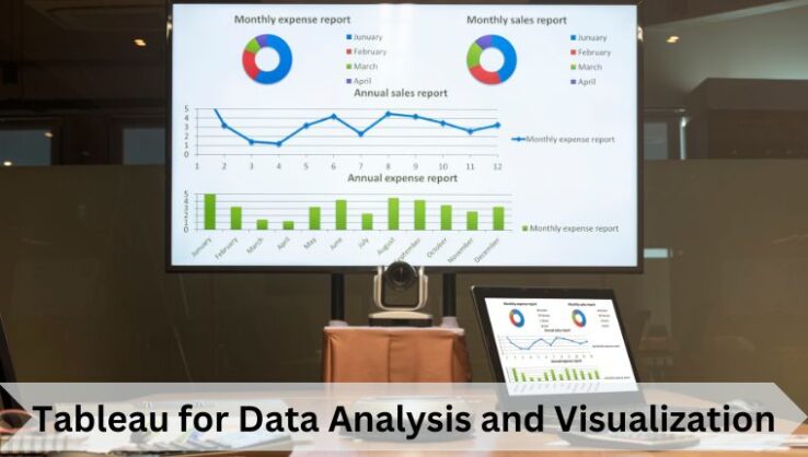
Tableau offers an easy-to-understand user interface where you can analyse data. Its advanced dashboard, attractive visual charts, and other features make it the best tool for data visualization.
The best way to learn data visualization in Tableau is by enrolling in a Tableau certification like the one by Edvancer. Before that, you must understand the basics of Tableau, its key features, and its advanced techniques for data analysis & visualization.
What is Tableau?
Tableau is a data visualization tool used in data analytics. It aims to enhance the flow of analysis and make data easy to understand for people by converting it into visuals. Tableau helps you analyse structured and unstructured data sets easily and identify the patterns in them. Apart from creating traditional charts and graphs, you can use Tableau to draw meaningful insights from the data.
Main Features of Tableau
Some key features of Tableau are as follows:- Attractive Visualizations: You can create different types of simple as well as complex visualizations.
- Advanced Dashboard: The advanced dashboard of Tableau allows you to view the data in the form of a story by selecting a format and layout of your choice.
- Security System: Tableau ensures the security of your data with a system based on permissions and authentication mechanisms.
- In-memory and Live Data: Tableau allows you to analyse data from various external sources by ensuring seamless connectivity between data extracted from all sources.
Advanced Tableau Techniques
The following are some best advanced Tableau techniques that make the data analytics process easier and much more efficient:
1. Segmentation and Cohort AnalyticsEvery business needs to understand its target audience very clearly. Segmenting your audience helps you to improve your marketing strategy and pull more earnings for every penny spent. A few of the questions segmentation will answer for you include:
- Who are your customers?
- What do they buy?
- What are their requirements?
- Where do they gather?
Cohort analysis in Tableau helps you with the segmentation. A cohort refers to a group of people having similar characteristics. It allows you to view all the data in one place and categorize it based on different factors using cohort analysis.
Segmentation can also be done using automated clustering, which is an unsupervised machine-learning technique. Tableau allows you to use clustering to segment large data, especially when there are lots of variables.
2. Advanced GraphsApart from the traditional line charts, bar graphs, etc., Tableau allows you to visualize data sets using several advanced graphs:
- Motion Chart: A motion chart uses the x-axis and the y-axis to represent the change in variables over time. The changes are marked by the movement of data points, and variation in the colours of data lines.
- Bump Chart: A bump chart is an advanced form of a line plot. It allows you to explore the ranks of different variables by comparing their positions. In short, it can be used to identify the popularity of products.
- Donut Chart: You can understand a doughnut chart as a pie chart with a hole in between. These charts are used to show the proportions of categorised data.
- Waterfall Chart: A waterfall chart helps you visualise positive and negative growth. You can use them to see changes in measures over the year.
- Pareto Chart: These are a combination of bar and line graphs. The chart presents the values in descending order and determines the most significant problems and risk management.
Tableau also allows you to implement statistical methods, such as Correlation, Skewness, Covariance, Mode, Kurtosis, Standard Deviation, etc. Moreover, you can use statistical models like K-Means, Naive Bayes, Random Forest, etc., to understand data and make predictions.
These features in Tableau help you solve complex calculations with ease. The calculation fields (LOD and table calculations) also allow you to develop new data points from the existing data.
4. Time Series and Predictive AnalysisTime series analysis helps identify seasonal trends, i.e., how certain variables change over time. Tableau provides a simple interface for time series analysis that helps you understand trends and patterns in data. With this, you can understand the data better and make predictions.
5. What-If AnalyticsThe flexible user interface of Tableau has seamless input capabilities. It helps in making calculations and determining different scenarios. You can see how the output gets affected by changing input parameters.
The ‘parameters’ feature allows you to change the initial conditions and helps in scenario analysis. The ‘story points’ feature allows you to define your scenarios.
Also Read: What is Tableau & Why Consider the Best Tableau Course Online?
Why Learn Data Visualisation in Tableau?
Data Visualization is an essential skill in the data analytics field. You can use several online visualization tools like Google Charts, Zoho Reports, IBM Watson, etc. However, Tableau is the most preferable one. It has a user-friendly interface and many advanced features that make data analysis a much smoother process.
More than 57,000 companies use Tableau for Data Visualization as it has the most advanced features. The demand for Tableau professionals is high in the data analytics job market. Even data analysts need to learn data visualization in Tableau along with analytics.
Certified Tableau Professional Course by Edvancer
Edvancer offers the ‘Certified Tableau Professional Course,’ which gives you comprehensive coverage of data visualization in Tableau. It covers data manipulation, customization, geographical analysis, and all other topics under Tableau. This course has the following features:
- 7 hours of learning and 25 hours of projects & assignments
- Self-paced program with faculty support
- No technical background requirements.
This Tableau course at Edvancer prepares you for the official Tableau certification exams and is the best option to start your career in data visualization. However, if you want to build a career in data analytics, you can check out other courses by Edvancer, including:
- Certified Data Analytics Specialist
- IIT Kanpur Advanced Data Analytics Certification
These courses also include data visualization in Tableau.
If your job involves dealing with data or using data to improve your decisions, Tableau can add instant value to you. While data analytics has become a career choice for many, data visualization is a versatile skill for all managers. If you want to build a career in data analytics, you will need to learn data visualization.
FAQs
1. What are the different types of charts and graphs that can be created using Tableau?
Different types of charts and graphs that you can create using Tableau are – Bar Graphs, Line Charts, Pie Charts, Motion Charts, Donut Charts, Scatter Plots, Density Maps, Bubble Chart, Waterfall Chart, Pareto Chart, etc.
2. What are the limitations of Tableau, and how can they be addressed?
Though Tableau is the best data visualization tool, it still has some limitations:
- There is no option for scheduling, and it always requires manual effort when data is to be updated in the back end.
- You cannot import new visuals, but only recreate them.
3. What are some real-world examples of organizations using Tableau for data analysis and visualization?
The following are some successful organizations using Tableau for data visualization:
– Amazon, LinkedIn, Adobe, Ferrari, Cisco, and Walmart.
Follow us on