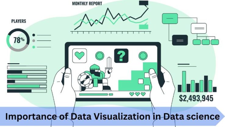
The Importance of Data Visualization in Data Science
One of the essential skills of a data scientist is data visualization. The Data Visualization market was estimated at $8.85 billion in 2019 and is expected to hit $19.2 billion by 2027. These statistics themselves prove the importance of data visualization in businesses. Keeping this in mind, data visualization is a part of the curriculum of all certificate and PG Diploma courses in data science.
PG Diploma in Data Science course is one of the fastest ways to switch gears and hit the field of data science running. As the field of data science is showing rapid growth, it is giving rise to new job opportunities in the market. Data Science professionals are in demand as the skill shows promise in the modern digital world. Due to this, data science has become a career choice for many.
If you want to become a data scientist, you must understand the role of data visualization in data science. It makes analysing data easy by displaying it as visuals, like graphs, infographics, pie charts, etc. With the right data visualization tools, the data analytics process can become efficient and fast.
What is Data Visualization?
Data Visualization is the process of converting textual or quantitative information into a visual format. It makes complicated data easier to understand. The data is represented in a graphical format to understand necessary trends and patterns in data. Data scientists use data visualization tools to conclude after collecting, analysing, and modelling large sets of data.
Basic data visualization is important in almost every career. However, it has significant importance in the field of data science. It helps in discovering data trends, identifying correlations, better risk management, and lots of other tasks that might be challenging without looking at visualized data.
Importance of Data Visualization in Data Science
Analysing large data sets can be complicated, but visualization makes them more valuable and easier to digest.- Provides a perspective on the data: Data visualization helps you understand how small data points stand in the larger picture. You can get a clear idea of what the information or data means.
- Puts data into the correct context: Comprehending the context of data is usually tough, and can be ambiguous in a tabular or text form. Putting the data in a visual format helps you grasp its whole circumstance, i.e., what the data is trying to say.
- Tells a Data Story: Human mind understands visuals better than any intricate textual information or tabular reports. Visualization keeps data in front of you as a story making the complex data facts easy to understand.
- Discover Trends in Data: Observing data trends and patterns becomes much easier when the data is represented visually. Text-based reports or large Excel spreadsheets can be much more challenging.
- Saves Time: The process of identifying trends and errors becomes much faster with the visual medium. It further accelerates the decision-making process in a business.
Also Read : The significance of Data Visualization in Big Data for Humans
Common Types of Data Visualization
Today, data visualization techniques are not just restricted to MS Excel spreadsheets or graphs. There are many more convenient techniques available. The following are some most common examples of data visualization:- Line Charts: Line charts are the simplest type of data visualization. These are used to observe how certain values change over time.
- Graphs: These are used to represent a set of variables in comparison to each other. Graphs can be in the form of a line, segments, curves, or areas.
- Scatter Plots: Scatter plots display the relationship between two variables. The variables are placed on the X & Y-axis and the data is represented using dots.
- Tables: Tables are one of the most common examples of data visualization. In this, different figures are shown in rows and columns.
- Infographics: Infographics refer to a combination of textual information and visuals to represent data. Aligning the information with relevant diagrams or graphs make makes it interesting and easy to understand.
- Geospatial: It shows data on a map using different colors or patterns to show the relationship of a set of variables with specific locations.
- Dashboards: Dashboards are used to represent data from multiple sources in one place to analyse it in a better way.
Tools For Data Visualization
Data Visualization Tools are software applications that can render data sets in a visual form. These tools make it easier for analysts to work with large amounts of data and represent them in visual formats. You can find lots of tools for data visualization online. Some top ones are listed below:
1. Tableau
Around 57,000 companies rely on Tableau for their data visualization needs. It can efficiently create graphics and visuals from large sets of data used for data science, machine learning, AI, etc. Tableau has an easy interface, making it convenient to use for every professional. Moreover, it is considered the top-performing tool to create visuals. Under Edvancer’s PG Diploma in Data Science, you get to learn data visualization in Tableau.
2. Zoho Reports
Zoho Reports or Zoho Analytics is another tool that creates extensive data reports in minutes. This tool also allows the import of large data from major applications and databases. It has a wide room for data and includes other useful functions, such as email scheduling, report sharing, etc.
3. Google Charts
Coded with HTML5 & SVG, Google Charts is popular for pictorial and graphical data visualizations. The platform is compatible with Android, iOS, and the older versions of internet explorer. The visuals created by Google Charts are attractive, however, it lacks customization features.
4. IBM Watson
This tool uses artificial intelligence and other analytical components to detect patterns from large data sets and represent them in visual formats. It is one of the best visualization tools for predictive analysis.
Get a PG Diploma in Data Science by Edvancer
The PG Program in Data Science at Edvancer gives you a UPES alumni status and is ranked among India’s top 5 data science courses. The course covers Business Analytics in R, Machine Learning in Python, and Data Analysis in SQL. The following features of this course make it different from the other online courses:- 150 hours of learning and 150 hours of projects & assignments.
- Two learning options to choose from: Live online classes and Self-paced learning through recorded sessions and video lectures
- Self-paced learning through recorded sessions and video lectures
- Training with 70% practical content.
- Top-class faculty from UPES.
FAQs
1. How can data visualization be used in data science projects?
Data visualization is used in data science to understand large datasets easily by converting them into visuals. Structured and unstructured data can be turned into graphs, charts, or pictorials to understand the context of the data and work on it accordingly.
2. What are some common types of data visualizations?
Some most common types of data visualizations are graphs, line charts, scatter plots, infographics, geospatial, tables, dashboards, etc.
3. Why is data visualization important in data science?
Data visualization helps verify your mathematical analysis or data model. It also helps you get a broad perspective on the data. Also, you can present complex data in a story format to help non-technical people understand your findings.
Follow us on