Edvancer's Knowledge Hub
Understand the data better by Visualisation

bar graphbimodal distributionbox plotdata sciencedata visualisationdescriptive statisticshistogramline chartmultimodal distributionpie chartscateer plot
Continuing with the last series of blogs, in this, we are going to explore graphical ways of representing descriptive statistics. We have learnt that we can get the measures of central tendency and dispersion to understand the centre and spread of the features (a variable is a feature in a dataset). It is easy to analyse with these measures when the data is small. For larger datasets with large feature space (variables), visualisation provides a quick, easy-to-read-and-interpret pictorial representation of the distribution of data.
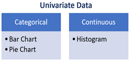
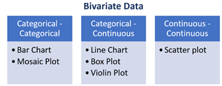
Graph Types for Univariate and Bivariate Data
 Histograms are used to visualise the distribution of a continuous variable. A histogram displays the frequency of occurrence of values of a variable. The values are converted into bins of values (on the horizontal axis) and on the vertical axis are displays bars corresponding to the count or percentage of observations falling in the bin.
Histograms help understand:
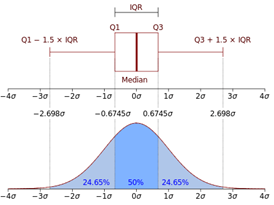
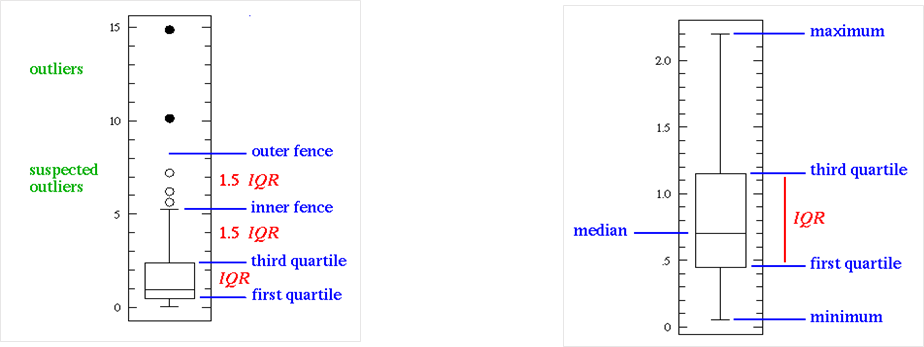
Box Plot displays the distribution of data based on the five-number summary: minimum, first quartile, median, third quartile, and maximum.
A box plot displays the full range of variation (from min to max), the likely range of variation (the IQR), a typical value (the median), and possible outliers. Since, boxplots break the data into quartiles, they work best when the data has at least 20 data points per group.
The image on the left shows how boxplots compare to the probability distribution function for a normal distribution. Notice how each whisker contains 24.65% of the distribution rather than an exact 25%. Boxplots consider the observation is beyond the whiskers to be outliers.
John Tukey has provided a precise definition for two types of outliers:
Outliers: Data points lying beyond 3×IQR or the third quartile, or 3×IQR or below the first quartile.
Suspected outliers: either 1.5×IQR or more above the third quartile or 1.5×IQR or more below the first quartile.
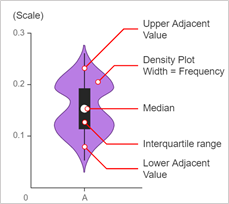
Violin Plots are a combination of boxplot and density plot to show the distribution of the data.
A violin plot shows the full distribution of the data along with the summary statistics (by box plot) such as mean/median and interquartile ranges.
Violin plots are particularly useful when the amount of data is huge, and the data distribution is multimodal. In this case, a violin plot shows the presence of different peaks, their position and relative amplitude.
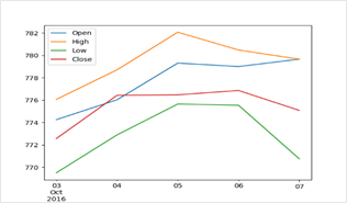
Line Graphs are used to display numerical values as a series of data points over a continuous interval or time period.
A Line Graph is similar to scatterplot except that the data in the line graph are chronologically ordered. Line graphs are usually used to show trends in data over intervals of time. The direction of the line indicates an upward or downward trend in the value of a feature over time.
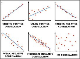
Scatter plots are similar to the line graph and depict the relationship between two numerical variables. Scatter plots graphically show how one variable is affected by a change in the values of another variable. Scatter plots capture the linear relationship between variables called Correlations.
Correlation could be positive meaning increase in the value of a variable results in an increase in another, could be negative meaning increase in the value of one variable leads to decrease in value of another, or the variables could be not related at all.
A line of best fit or a trendline can be drawn in order to study the relationship between the variables. An equation for the correlation between the variables can be determined by established best-fit procedures. For a linear correlation, the best-fit procedure is known as linear regression.
An interesting point to note about correlation is that correlation does not mean causation i.e. change in one variable does not cause the change in another variable. Correlation merely indicates the association between the variables.
References:
http://www.cs.put.poznan.pl/jstefanowski/sed/DM14-visualisation.pdf
https://homes.cs.washington.edu/~suinlee/genome560/lecture1.pdf
http://www.physics.csbsju.edu/stats/box2.html
https://datavizcatalogue.com/methods/violin_plot.html
https://statisticsbyjim.com/basics/data-types/
http://www.j-pcs.org/viewimage.asp?img=JPractCardiovascSci_2018_4_2_116_240962_f1.jpg
Histograms are used to visualise the distribution of a continuous variable. A histogram displays the frequency of occurrence of values of a variable. The values are converted into bins of values (on the horizontal axis) and on the vertical axis are displays bars corresponding to the count or percentage of observations falling in the bin.
Histograms help understand:
Box Plot displays the distribution of data based on the five-number summary: minimum, first quartile, median, third quartile, and maximum.
A box plot displays the full range of variation (from min to max), the likely range of variation (the IQR), a typical value (the median), and possible outliers. Since, boxplots break the data into quartiles, they work best when the data has at least 20 data points per group.
The image on the left shows how boxplots compare to the probability distribution function for a normal distribution. Notice how each whisker contains 24.65% of the distribution rather than an exact 25%. Boxplots consider the observation is beyond the whiskers to be outliers.
John Tukey has provided a precise definition for two types of outliers:
Outliers: Data points lying beyond 3×IQR or the third quartile, or 3×IQR or below the first quartile.
Suspected outliers: either 1.5×IQR or more above the third quartile or 1.5×IQR or more below the first quartile.
Violin Plots are a combination of boxplot and density plot to show the distribution of the data.
A violin plot shows the full distribution of the data along with the summary statistics (by box plot) such as mean/median and interquartile ranges.
Violin plots are particularly useful when the amount of data is huge, and the data distribution is multimodal. In this case, a violin plot shows the presence of different peaks, their position and relative amplitude.
Line Graphs are used to display numerical values as a series of data points over a continuous interval or time period.
A Line Graph is similar to scatterplot except that the data in the line graph are chronologically ordered. Line graphs are usually used to show trends in data over intervals of time. The direction of the line indicates an upward or downward trend in the value of a feature over time.
Scatter plots are similar to the line graph and depict the relationship between two numerical variables. Scatter plots graphically show how one variable is affected by a change in the values of another variable. Scatter plots capture the linear relationship between variables called Correlations.
Correlation could be positive meaning increase in the value of a variable results in an increase in another, could be negative meaning increase in the value of one variable leads to decrease in value of another, or the variables could be not related at all.
A line of best fit or a trendline can be drawn in order to study the relationship between the variables. An equation for the correlation between the variables can be determined by established best-fit procedures. For a linear correlation, the best-fit procedure is known as linear regression.
An interesting point to note about correlation is that correlation does not mean causation i.e. change in one variable does not cause the change in another variable. Correlation merely indicates the association between the variables.
References:
http://www.cs.put.poznan.pl/jstefanowski/sed/DM14-visualisation.pdf
https://homes.cs.washington.edu/~suinlee/genome560/lecture1.pdf
http://www.physics.csbsju.edu/stats/box2.html
https://datavizcatalogue.com/methods/violin_plot.html
https://statisticsbyjim.com/basics/data-types/
http://www.j-pcs.org/viewimage.asp?img=JPractCardiovascSci_2018_4_2_116_240962_f1.jpg
Share this on
Follow us on
 Histograms are used to visualise the distribution of a continuous variable. A histogram displays the frequency of occurrence of values of a variable. The values are converted into bins of values (on the horizontal axis) and on the vertical axis are displays bars corresponding to the count or percentage of observations falling in the bin.
Histograms help understand:
Histograms are used to visualise the distribution of a continuous variable. A histogram displays the frequency of occurrence of values of a variable. The values are converted into bins of values (on the horizontal axis) and on the vertical axis are displays bars corresponding to the count or percentage of observations falling in the bin.
Histograms help understand:
- the centre of the data i.e. whether the data is symmetrically centred around mean or is asymmetric in nature
- the dispersion of data i.e. whether the data is closely clustered around the mean or spread out more in either direction
- the skew if the data i.e. whether the data is left-skewed or right-skewed.
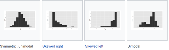
Figure 1: Histograms representing various distributions of data
- the data is bimodal meaning the data might be from two different distributions or processes or from a process that frequently shifts.
- the data is multimodal meaning the sample might have two or more different subpopulations which have different characteristics.
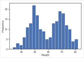
Figure 2: Multimodal Distribution
Bimodal and multimodal distributed data needs in-depth analysis to find out whether the data has different peak values in the distribution by virtue of the characteristics of one population or the population exhibits extreme patterns or behaviours or comes from a number of distinct groups. For example, if we were to measure the weights of a randomly selected group of men and children, we would expect a bi-modal distribution with a peak at around 50kg for children and 70kg for men.- Histograms can also be used to identify outliers.
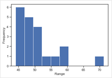
Figure 3: Histogram depicting Outliers
In this histogram, the bar at value 70 looks like an outlier. An outlier would be an isolated bar in a histogram. This observation should be analysed carefully to see if this is an error in measurement or an observation occurred under unusual conditions or it might be an observation that accurately describes the variability in the study area. Bar graph represents categorical data summarized in a frequency, relative frequency, or percent frequency distribution.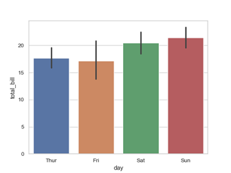
Figure 4: Distribution of total bill on weekdays and weekend
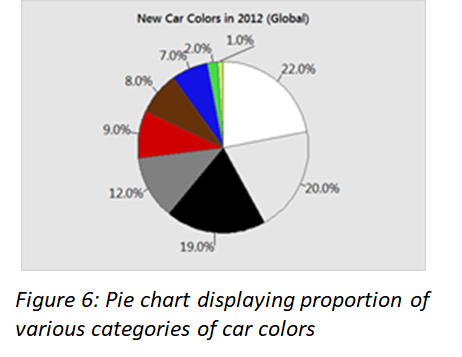
A bar graph shows comparisons among discrete categories. One axis of the chart shows the specific categories being compared, and the other axis represents a measured value. Bar graphs are also a useful method of visualising ordinal i.e. ordered categorical data. Bar charts arranged from highest to lowest incidence are called Pareto charts. When there is no natural ordering of the categories being compared, bars on the chart may be arranged in any order. Pie chart is commonly used for presenting relative frequency distributions for qualitative data. The circle is divided into sectors corresponding to the relative frequency for each class. We can use pie chart when categories have no particular order or are dichotomous.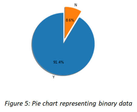
 Box Plot displays the distribution of data based on the five-number summary: minimum, first quartile, median, third quartile, and maximum.
A box plot displays the full range of variation (from min to max), the likely range of variation (the IQR), a typical value (the median), and possible outliers. Since, boxplots break the data into quartiles, they work best when the data has at least 20 data points per group.
Box Plot displays the distribution of data based on the five-number summary: minimum, first quartile, median, third quartile, and maximum.
A box plot displays the full range of variation (from min to max), the likely range of variation (the IQR), a typical value (the median), and possible outliers. Since, boxplots break the data into quartiles, they work best when the data has at least 20 data points per group.
 The image on the left shows how boxplots compare to the probability distribution function for a normal distribution. Notice how each whisker contains 24.65% of the distribution rather than an exact 25%. Boxplots consider the observation is beyond the whiskers to be outliers.
 John Tukey has provided a precise definition for two types of outliers:
Outliers: Data points lying beyond 3×IQR or the third quartile, or 3×IQR or below the first quartile.
Suspected outliers: either 1.5×IQR or more above the third quartile or 1.5×IQR or more below the first quartile.
Violin Plots are a combination of boxplot and density plot to show the distribution of the data.
John Tukey has provided a precise definition for two types of outliers:
Outliers: Data points lying beyond 3×IQR or the third quartile, or 3×IQR or below the first quartile.
Suspected outliers: either 1.5×IQR or more above the third quartile or 1.5×IQR or more below the first quartile.
Violin Plots are a combination of boxplot and density plot to show the distribution of the data.
 A violin plot shows the full distribution of the data along with the summary statistics (by box plot) such as mean/median and interquartile ranges.
Violin plots are particularly useful when the amount of data is huge, and the data distribution is multimodal. In this case, a violin plot shows the presence of different peaks, their position and relative amplitude.
Line Graphs are used to display numerical values as a series of data points over a continuous interval or time period.
A violin plot shows the full distribution of the data along with the summary statistics (by box plot) such as mean/median and interquartile ranges.
Violin plots are particularly useful when the amount of data is huge, and the data distribution is multimodal. In this case, a violin plot shows the presence of different peaks, their position and relative amplitude.
Line Graphs are used to display numerical values as a series of data points over a continuous interval or time period.
 A Line Graph is similar to scatterplot except that the data in the line graph are chronologically ordered. Line graphs are usually used to show trends in data over intervals of time. The direction of the line indicates an upward or downward trend in the value of a feature over time.
Scatter plots are similar to the line graph and depict the relationship between two numerical variables. Scatter plots graphically show how one variable is affected by a change in the values of another variable. Scatter plots capture the linear relationship between variables called Correlations.
Correlation could be positive meaning increase in the value of a variable results in an increase in another, could be negative meaning increase in the value of one variable leads to decrease in value of another, or the variables could be not related at all.
A Line Graph is similar to scatterplot except that the data in the line graph are chronologically ordered. Line graphs are usually used to show trends in data over intervals of time. The direction of the line indicates an upward or downward trend in the value of a feature over time.
Scatter plots are similar to the line graph and depict the relationship between two numerical variables. Scatter plots graphically show how one variable is affected by a change in the values of another variable. Scatter plots capture the linear relationship between variables called Correlations.
Correlation could be positive meaning increase in the value of a variable results in an increase in another, could be negative meaning increase in the value of one variable leads to decrease in value of another, or the variables could be not related at all.
 A line of best fit or a trendline can be drawn in order to study the relationship between the variables. An equation for the correlation between the variables can be determined by established best-fit procedures. For a linear correlation, the best-fit procedure is known as linear regression.
An interesting point to note about correlation is that correlation does not mean causation i.e. change in one variable does not cause the change in another variable. Correlation merely indicates the association between the variables.
References:
http://www.cs.put.poznan.pl/jstefanowski/sed/DM14-visualisation.pdf
https://homes.cs.washington.edu/~suinlee/genome560/lecture1.pdf
http://www.physics.csbsju.edu/stats/box2.html
https://datavizcatalogue.com/methods/violin_plot.html
https://statisticsbyjim.com/basics/data-types/
http://www.j-pcs.org/viewimage.asp?img=JPractCardiovascSci_2018_4_2_116_240962_f1.jpg
A line of best fit or a trendline can be drawn in order to study the relationship between the variables. An equation for the correlation between the variables can be determined by established best-fit procedures. For a linear correlation, the best-fit procedure is known as linear regression.
An interesting point to note about correlation is that correlation does not mean causation i.e. change in one variable does not cause the change in another variable. Correlation merely indicates the association between the variables.
References:
http://www.cs.put.poznan.pl/jstefanowski/sed/DM14-visualisation.pdf
https://homes.cs.washington.edu/~suinlee/genome560/lecture1.pdf
http://www.physics.csbsju.edu/stats/box2.html
https://datavizcatalogue.com/methods/violin_plot.html
https://statisticsbyjim.com/basics/data-types/
http://www.j-pcs.org/viewimage.asp?img=JPractCardiovascSci_2018_4_2_116_240962_f1.jpg
Latest posts by Yogita Kinha (see all)
- A simple guide to Hypothesis Testing - September 24, 2019
- Accelerate your job search with Word cloud in Python - September 22, 2019
- AI revolution in Healthcare industry - September 8, 2019
Follow us on
Free Data Science & AI Starter Course
